Felt flower power with a pop of personality

Read on for my tips on choosing your own colour palette for your felt flowers.
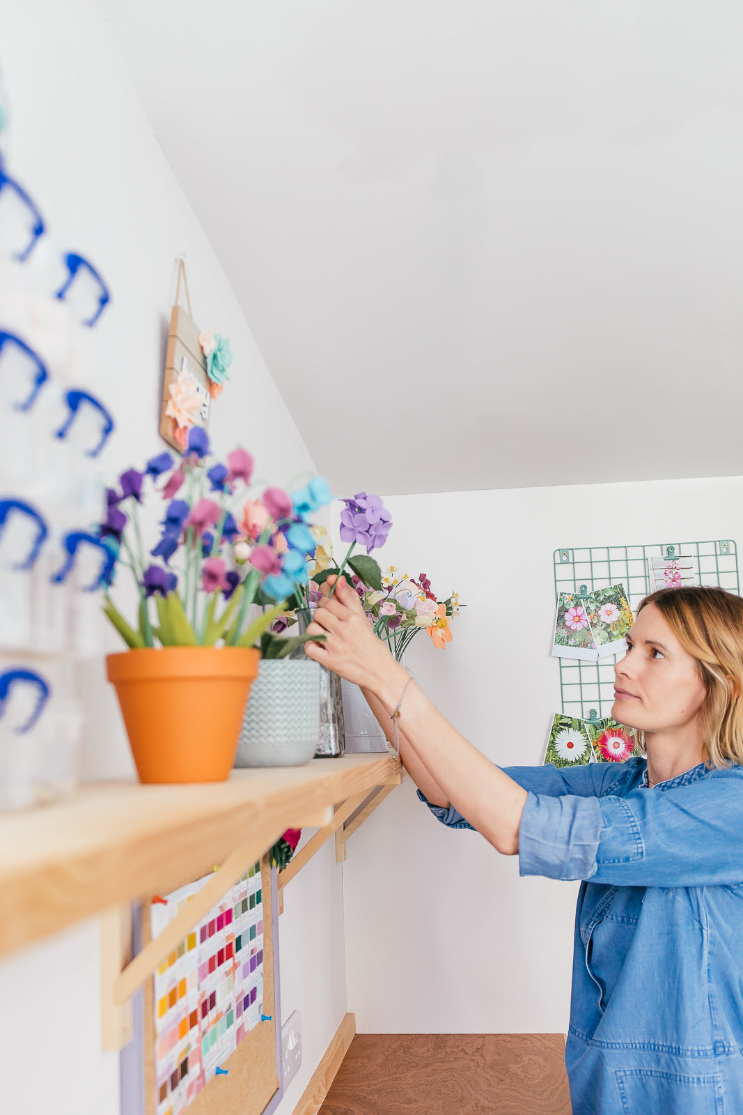
I’ve always loved the process of choosing a colour palette for a project and seeing the colours come to life as my flowers take shape. But choosing the ‘right’ colours isn’t always easy and it can be tricky to strike the right balance, which is why all my PDF tutorials detail suggested colours and the felt shades in my craft kits have been carefully handpicked for you. But there’s no reason you can’t also create one of my projects in your own chosen shades! Today I’m sharing my tips on selecting a colour palette for your felt flower projects
Ready to level up your felt flower game? Let's dive in!

Picking the perfect felt flower colour palette for any season:
- Start bold! What colours do you envision taking centre stage in your creation? Don't be afraid to make a statement with your focal flowers.
- Inspiration is everywhere. Look beyond the garden - draw colour inspiration from anywhere: a quirky wallpaper, a row of beach huts, a captivating landscape painting, or even a jar of mismatched buttons! Don't forget to snap a photo of anything that catches your eye for future reference.
- Consider the context. If your flowers are destined for a specific room or season, think about the surrounding colours they'll interact with. What will complement the overall aesthetic?
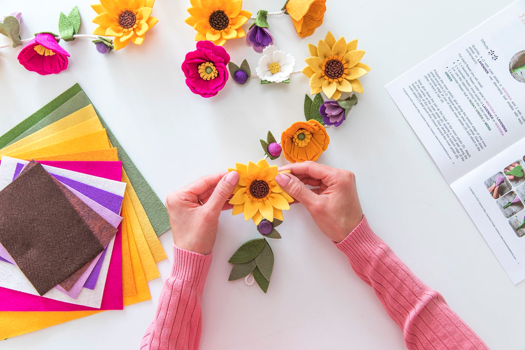
- Embrace the spectrum! Don't settle for just "red" or "yellow." Explore different shades and tones within a single colour to add depth, texture, and visual interest to your felt blooms. Take my Peaches and Cream Dragonfly Bouquet for example - it features a vibrant orange, yellow, and red theme, but utilises various shades within each colour for a dynamic effect. ❤️
- How many colours? While there's no hard and fast rule, aiming for at least six colours or shades in a full bouquet helps create a visually diverse display.
- Spice things up! Introduce accent colours to draw the eye to specific shapes and textures, adding a touch of playful pizzazz to your arrangement. ✨ In my bouquet, the deep reds and oranges are balanced by pops of bright gold and yellow, bringing the whole piece to life.
- Take a breather. Cut swatches of your chosen colours, arrange them side-by-side, and step back. Take a photo, or better yet, leave it for a day or two to see how the colours settle in your mind. Sometimes, a little distance can spark fresh inspiration! Don't be afraid to tweak and adjust as you go.
- Harmony in repetition. Using the same colour shades across different flowers creates a sense of cohesion and ties your bouquet together as a unified artwork. For instance, the yellow used in one flower's petals could reappear as the centre of another. Felt balls in matching hues can also connect the various blooms.
- Don't forget the greens. Choose one or two shades of green for your leaves and foliage to ground your palette and allow the other colours to shine. Opt for bright greens for a spring feel or deeper shades for a cosy autumn or winter vibe.
- Creativity unbound! Don't feel limited by traditional flower colours. If you have a colour crush, embrace it! The beauty of felt flowers lies in the freedom to express your unique style.
I hope these tips help you unleash your inner colour maestro and create felt flowers that spark joy. If you have your own colour-picking wisdom to share, leave a comment below. You can also find me on Instagram and Facebook (@thehandmadeflorist) and don't forget to share your felt flower creations using the hashtag #thehandmadefloristmakes - I can't wait to see your masterpieces blossom!
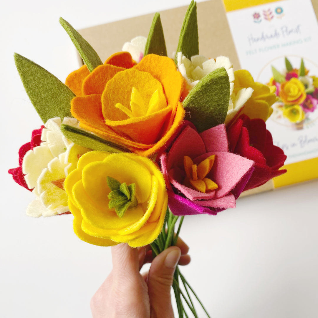
P.S. For those curious about the specific colours used in the bouquet pictured, here's the breakdown:
Poppies: Red (Purple Heart) with deep orange (Pumpkin Spice) inner and a deep red felt ball
- Osteospermum: Gold and Sunshine Yellow (Eternal Sunshine) petals with deep orange inner
- Pinks (not pink at all in this case!): Orange (Butternut Squash) and deep orange - I LOVE how these subtly different shades of orange work together here
- Pom Pom Daisies: Garnet (Grandma’s Garnet) with deep orange centre; Gold with Sunshine Yellow centre
- Dragonflies: Gold, Sunshine Yellow and Garnet
- Leaves and leaf stems: Grass Green (Grassy Meadow)